
Restructuring the homepage
Multi-user Architecture
Information at the right time.
The platform should operate as a high-speed utility, surfacing the right information only when it matters for decision-making.
For MVP, we had to engineer a single framework for multiple customer types
-
-
The Independent: Optimized for Velocity—low-friction, one-touch re-ordering.
-
The Hospital System: Optimized for Governance—HIMS integration and rigorous audit transparency.
- Specialty Profiles: Within the customer migration are multiple other customer profiles.
-


Strategic Leadership
-
Cross-Functional Alignment: Partnered with Product, SAP Engineering, and Marketing to ground design strategy in technical feasibility.
-
Constraint Translation: Transformed system data limitations into design guardrails, prioritizing critical functionality over fluff.
-
Accelerated Decisions: Facilitated rapid wireframe iterations to drive fast alignment and maintain project velocity.
| Current Pain Point | User Impact |
|---|---|
| Crucial updates are hidden within marketing components or visually distracting areas. | Users waste time searching for vital operational information, increasing stress and risking outdated ordering decisions. |
| Information is not always reliable; as a result, users don't always trust the data enough to make a decision. | The platform erodes trust, forcing users to slow down for manual verification. |
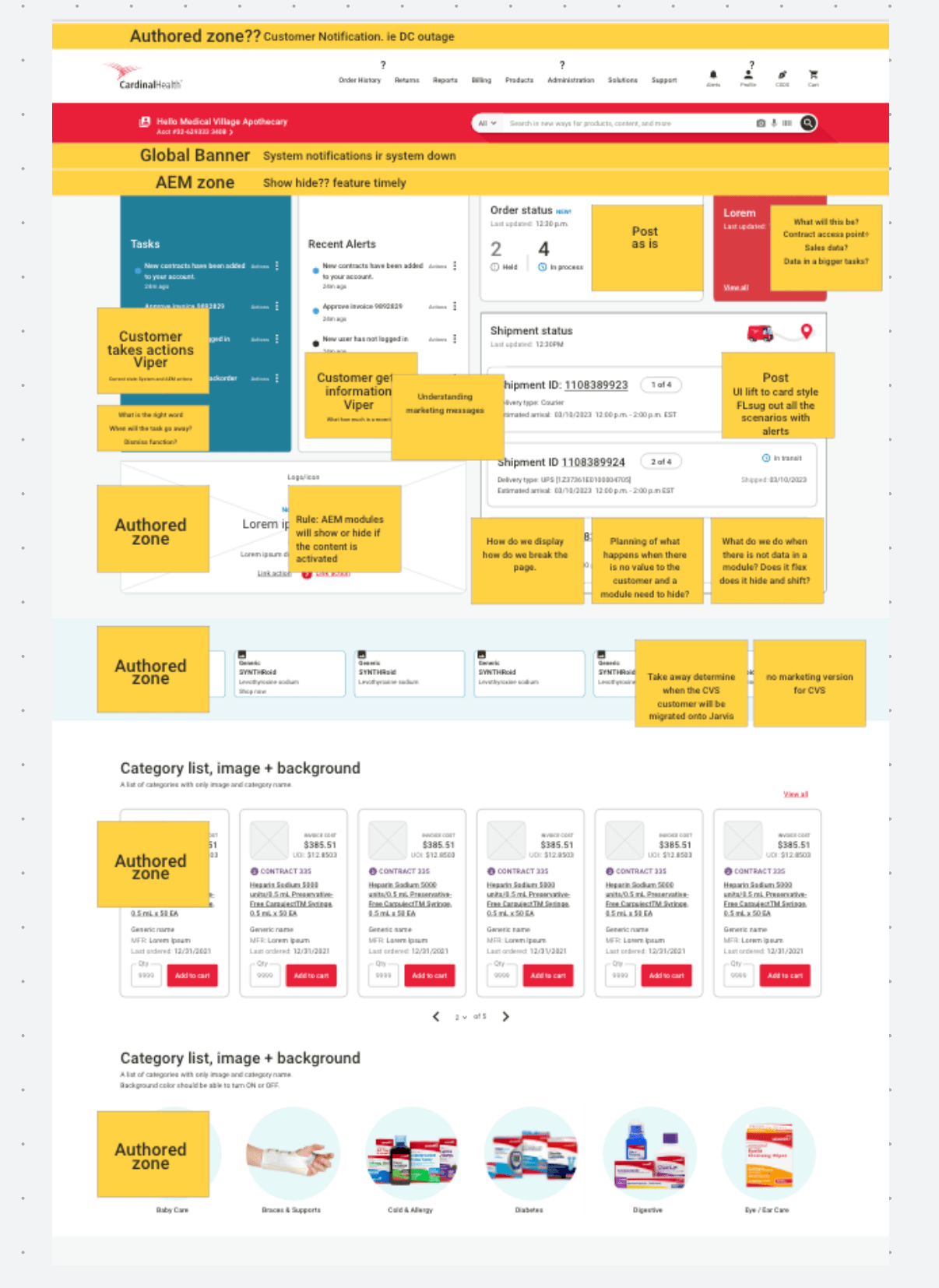
Strategic Prioritization:
Strategic Prioritization: Focused on functional utility over non-essential features to deliver a lean MVP. This drastically reduced "Time to Task Completion," keeping the focus on patient care rather than the software.
4 Critical Pillars identified:
Time-Sensitive Information: Streamlining immediate updates (shortages, stock).
Order & Shipment Data: Creating transparency around tracking and logistics.
Modernized Navigation: Implementing established UX conventions to eliminate friction.
Business enablment. AEM marketing elements supporting strategic intatives and product information.
Design Decisions
Design Challenges & Solutions
-
The Challenge: User research demanded real-time alerts, but a technical constraint forced all notifications into a single module.
-
The Pivot: Shifted focus from replicating old user habits to architecting a new hierarchy optimized for high-value data.
-
The Decision: Partnered with tech and product leads to champion the technical isolation and prioritization of critical alerts.
-
The Outcome: Surfaced high-priority updates clearly on the homepage, balancing user needs with system limitations.

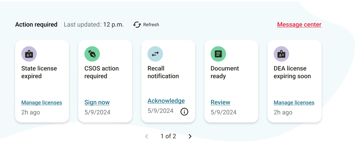
Part 1: Action-required Zone
The UX team architected a hierarchy to satisfy both customers and business stakeholders:
-
Visual Compression: Used purposeful iconography to manage density, keeping contract data scannable alongside the promo.
-
Functional Advocacy: Iterative testing ensured "need-to-know" insights remained the focal point, preventing marketing content from eclipsing core tasks.
Note: Marketing required a prominent AEM promo module in the hero section—the same "high-value real estate" users needed for critical contract data.
High Adoption Intent: Initial user research confirms strong adoption metrics by delivering the right data at the right time.

Part 2: Post-purchase Zone
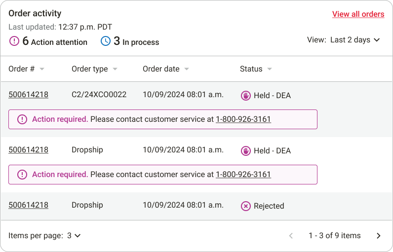
The Need: Users required immediate visibility into critical order status updates to manage their workflows efficiently.
The Constraint: Limited backend data availability threatened real-time information integrity during the MVP phase.
The Decision: Create a cohesive UX pattern using "lead-in" data indicators, allowing users to quickly scan and locate key updates without overloading the system's limited data.

Part 3: Navigation
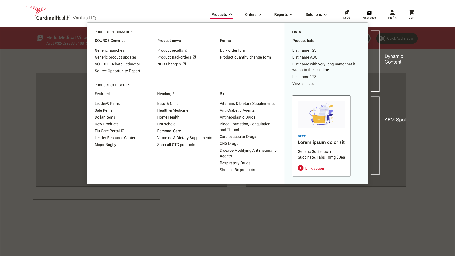
The Challenge: Homepage "content bloat." Business promotions competed with functional navigation, creating high cognitive load for users.
The Strategy: Conducted Tree Testing to isolate and validate the Information Architecture (IA)—ensuring the hierarchy and labeling made sense before introducing visual design.
| Focus Area | Solution |
| Noise Reduction | Relocated secondary content from the homepage to contextual locations within the platform where users actually needed it. |
| Business vs. User | Created dedicated, segmented zones for AEM (Adobe Experience Manager) promotional content so that marketing goals did not obstruct critical task pathways. |
| Data-Driven IA | Replaced internal assumptions with user-validated insights to determine the most intuitive location for every menu item |
Outcomes
-
Streamlined Pathways: Users can now navigate to core tasks without "fighting" promotional noise.
-
Optimized Real Estate: Strategic segmentation allowed us to meet business requirements for product promotion while maintaining a 100% focus on usability.
-
Validation: Decisions were backed by behavioral data, reducing stakeholder friction and ensuring a user-centric final product.
-
High Adoption Intent: Initial user research confirms strong adoption metrics by delivering the right data at the right time.
-
Validated Team Model: Proved that a leadership structure rooted in technical feasibility and cross-functional transparency ensures predictable product delivery.
%
Lift on a $B++ platform
%
Increase in overall satisfaction since launch.
Storefronts into one platform.


